World Wide Web Development Timeline: 14/12/23
Dreamweaver Coding Work: 27/11/23
This is the web design I created using Adobe Dreamweaver as I have been able to use coding to change the background of a file, add text and images, and align them to specific parts of the webpage. The way I did this was by copying and pasting text and making sure each bit of code was all correct and was in the right place along with making sure it was all saved in a folder and taking a picture to show what I made.
UX and UI Design: 04/12/23: Homework
When looking at mobile design the best practices and strategies for a perfect mobile design are Speed, clutter, accessibility, UI feedback simple navigation, and No web experiences. these are important since you should make sure your app feels functional to anyone and usable at any given moment which is why you should look out for constraints such as storage, environment, and how big the screen and window should be.
Planning my app and App Research: 13/12/23
Stanmore College App:
Here is an example of an app I would like to replicate the style. The Stanmore College app is informative, helpful, and simple and this is important because many apps have to have informative elements to them whilst also having a simple interface and layout.
The app is helpful as anyone can sign into it and will show the person's attendance, timetable, and messages along with any documents necessary for learning.
Each page has a different layout with a sidebar down the bottom to allow easy access to other pages of the app from the 5 launch-off points.
Experimenting using Adobe XD: 06/12/23
Here is the start of my experimentation with Adobe XD in creating an App prototype. I will continue to update my blog with pictures tracking the progress of my app project. I've managed to create a title and two components along with testing out different colors for the fonts and drawing when using the text and line tools.
here is how far I have gotten with experimenting with Adobe XD
I continued making my prototype app more interesting and I had to add more pages so that there was more content available. I experimented with the rectangle and Repeater tool in XD when creating the chairs board as it made it very easy to have more than three boxes for products on screen at once.
I was able to create launch-off points with the link tool in prototype mode which showcased smooth transitions going onto different pages.
Website Feedback and Usability:
So far my website has been steadily being perfected and I am trying my best to make it look interesting and good.
So far I have tested the usability on a few people and the feedback they gave me was that I needed to change up some small things with the end of paragraphs along with adding some extra things. Most replies said my website had good usability and a simple but effective structure with a vibrant design an organized layout and a good description of each part. the general feedback also claimed it was informative and useful showing that I have made a functioning website that educates people on the thing it is promoting or about so that anyone could use it and be interested in it. I believed that my website should connect with my magazine as I thought it could be a company and that the website would promote more than just a magazine to people by offering merchandise and advice to people who connect with any community.
I asked some people what they would add to my website if they could and the results were interesting one person suggested improving my portfolio one said an FAQ and contact us page would be good and another suggested a video about the website topics. However, my website has been said it deliver a strong message and attract the target audience.
There were some issues with my website such as the layout needing to be adjusted and some text arrangements in paragraphs to make them look more neat, especially with having one word at the end of paragraphs (orphans). I also should've considered adding an AQ page as many people have mentioned how having a page like that could answer loads of questions people have when viewing the website.
Website Pictures and link: 22/01/23:
here are pictures of my finished website.
here is the link to my website
Final App Interactivity: 18/01/24
here is a video showing the interactivity of my Finalised app.
Final App design:
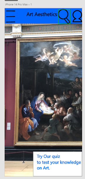
Here is the home screen and pages of my final Design and ideas for my app.
App Evaluation: 22/01/24
https://xd.adobe.com/view/2c1cb66a-f2c0-44ea-905b-1567b5d516dc-794f/
here is my finished app link and I will give my thoughts on the feedback I receive from others and go through what people liked and didn't like about my app.
I think my app came out well since I used a vibrant and simple color scheme with a good idea and execution. however, I would say that it was hard trying to figure out how to link each page and I also didn't have that many ideas on what each page on my app what be about and how they would relate to the theme of my app. After doing experimentation with Adobe Dreamweaver I thought of a good idea to have my app themed around paintings since I had loads of pictures from our national gallery trip that were never used until then. along with a vibrant colour scheme my app has been made to the best of my abilities and I am proud that I have been able to utilize and experiment with Dreamweaver to create something interesting.
I have received feedback on my app from others and the usability of my app is good as all the buttons work and is informative and the colour scheme is nice. One of the questions I asked was what would people change or add to my app if they made it and so far the response has been to add more to the quiz page of my app by adding more questions and descriptions for the paintings.
Opening Scene rough cut: 01/02/24:
Opening scene (Rough cut) Feedback: 05/02/24
when coming up with my idea for my opening scene I wanted it to connect to my area of investigation of the community so I had only one good idea in mind which kept switching as I kept thinking of different ways to shoot it or what would happen which is why it came out differently to how I originally planned however I believe that it was a better idea to change it up. after we had filmed I named the title of my short film community however since the music and shots didn't connect with the theme I changed it to solitude as it fit more with the tone that my rough cut came out with in the end.
Originally my scene would've had more than two people since it was going to focus on someone who was alone avoiding different communities and friend groups when walking through college. that idea is still present as most of the shots are of one person but then by the end he meets someone and to connect the scene with the community I had most of the video in black and white and then changed back to color when there was an interaction.
the feedback that I have received from peers has given me insight on what to improve. I was told that the quality of the video wasn't great but the idea was simple and good for a short opening scene. the length is also an issue along with the story as it doesnt really have a good conclusion in the end and doesnt make a lot of sense since there isn't any context. the cinematography is good and the music sets the mood and tone along with having great cuts but there is a problem with some of the camera shake which one person mentioned was a bit distracting.
if I were to change or add anything I would make sure that each cut and scene is edited well so that nothing looks out of place. the camera shake would also have to be fixed and I would also make the scene a bit longer and maybe add one or two more people in to have the scene make more sense and connect with my area of investigation as the scene doesnt really connect with the topic of community all that well.
the music and audio of my opening scene is diegetic as both the main character and audience can hear the soundtrack comes from bensound.com and was added after i had removed the audio from the camera recording in post production. i wanted there to be music that would set the tone for the opening scene. when editing i made sure that towards the end the soundtrack music would fade in and out at certain parts so that some dialogue and ambient foley sounds could be recorded before the rough cut ended. if i were to improve on the audio aspect of my rough cut i would maybe try to blend both the soundtrack and camera audio by having the soundtrack be heard through the characters headphones whislt every other sound is still heard on the outside as non diegetic sounds for the audience to hear.


.png)
.png)


No comments:
Post a Comment