Mise En Scene 16th October 2023:
1- Settings and props - the objects and location visible in a scene and are used to amplify characters' emotions or set the mood which affects the physical and social significance of the film.
2- costume, Hair and make-up - anything that the actors wear or any cosmetic changes to their body or hair as costumes have to be true to the character as this conveys meaning sometimes and also calls attention to graphic qualities through stylisation. costumes also convey what film is being made through the type of outfit and style that is trying to be replicated.
3- facial expressions and body language - used to convey emotions and feelings along with displaying how a character acts and what gestures they will make in conversations and since the viewers are focused on the actor's face upper body body language emphasises emotions and thoughts through the actor's face.
4- Lighting and colour - this can be used to highlight key characters like the protagonist and antagonist in a film whilst conveying meanings of a film vision by setting the mood and colour suggests a character's emotions and may have symbolic meaning
5- Positioning of characters/objects within the frame - camera positions convey the progress of the narrative and action from the way a character or object may be placed within the frame as the viewer may be able to tell their status, their intention or relationship to another character or to the frame.
1- Low-key
2- the lighting suggests solitude as the man is the only one highlighted by the light.
1- high key
2- the lighting highlights some of the environment along with the man and the care signifying that they are important.
1- High key
2- both characters are highlighted in a way that they are having a conversation.
1- low key
2- light is coming from the door and is the only major light source in the area as the atmosphere is very dark signalling that this scene is a confrontation.
costumes - casual and normal
facial expressions and body language - concerned scared and vigilant because of either someone or something that is off-screen.
lighting and colour - the two protagonists are highly lit most likely ambient lighting has been used and the colour is mostly blue and white which connects to the setting that they are in.
positioning - the two characters are positioned as if they are looking at something off-screen along with a crashed helicopter positioned behind them in the background to signify they have most likely survived a crash.
setting - outdoors most likely a back garden in a suburban neighbourhood because of the lawn chair alone and the inclusion of the laptop as a prop.
costumes - laid back, simple and smooth
Facial expressions and body language - intrigued at something off-screen above him and chilled out
Lighting and colour - the character is the main one in light alone with his surroundings most likely the light is coming from where he is looking and the colour comes from the objects and his surroundings with the lawn chair standing out and the bushes in the background.
Positioning - the character is positioned in the centre of the frame looking up at someone or something off screen with a table off to the left of the frame.
Setting - the ocean or in the water because of their hair and clothes being wet and there aren't any props
costumes and hair - regular outfits along with their hair looking frozen as if it is freezing cold in the area they are in
lighting and colour - ambient light is used while the colour is blue to connect to the ocean and coldness of the situation
positioning - both characters are in the centre of the frame very close to one another indicating a sense of romance.
Setting - the characters are around an open sky with nothing in the background except for some ropes to suggest that they are on a ship. there are also no props visible in this scene.
costumes- old fashioned and period accurate to the 1900s as both characters seem to be wearing similar outfits down to the colour scheme and design.
facial expressions and body language- they both appear happy and excited with their body language indicating romantic gestures with the guy holding the woman's waist.
lighting and colour - high key lighting as their foreheads are highlighted due to a bright light possibly the sun on the horizon off-screen. the colour is a warm orange conveying that this is a romantic scene along with the orange coming off from the sun offscreen.
positioning - both characters are in the centre of the frame indicating they are the protagonists and that they are romantically together
.png)
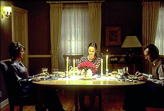
setting - a suburban house in the dining room with the characters having dinner with the props being normal cutlery, candles and plates.
costumes and hair - the costumes seem to resemble the 1980s or 90s and the hair reflects that too
facial expressions and body language - the girl in the middle is sad along with her parents looking concerned and stern seeming as if they are about to ask her a serious question and start talking.
lighting and colour - the girl in the middle is lit with key lighting and her parents are dimly lit on either side. the colour is mostly yellow due to the light.
positioning - the girl is positioned in the centre of the frame between her parents who are on either side of her to indicate they are about to have a conversation
Opening Scene Analysis: 09/11/23
Spider man Into the Spider-verse (2018) Superhero genre:
The opening of the film showcases what it is like to be spider-man as we are given a detailed explanation of Peter Parker's life as we meet him after he has been Spider-man for 10 years and we see how perfect his life is and how ''there is only one spider man'' which the scene then changes to showcase miles morales life in which the audience is tricked into thinking at first the film will follow peter parker however miles immediately becomes the main character and we see how his life isn't as perfect with him going to school and how he knows everyone at his old school but no one knows him at his new school which allows the audience to connect and relate to the character as everyone who has gone to school had friends in their old school yet in their new school they have no one making them seem an outcast in which the protagonist perfectly resembles and states to other characters because he feels like he doesn't belong in this new school.
the setting is New York where most superhero films take place and the costumes mostly feel like modern-day outfits with hoodies and uniforms that all stand out because of how vibrant they are.
Baby Driver (2017) Action genre:
The opening credits do an excellent job showcasing visual storytelling as we have our protagonist Baby walking towards a coffee shop whilst listening to music. As he walks his environment/setting is shown clearly along with it changing toward the end of the scene as different parts of the environment either change colour or style. As he walks he moves in groovy and interesting ways but also shows off his carelessness as he nearly gets run over by cars twice and happily grooves down a busy street with not a care in the world which gets the audience interested in his personality and because he listens to music immediately many people can relate to him with how he uses headphones to listen to music. we see loads of different people as he walks along that showcase different stereotypes such as a man waving for a taxi or a preacher protesting something these background characters allow the film to feel more real as we all know these stereotypes in real life. the costumes are basic but showcase what type of character we are following as Baby's outfit is mostly black and white which is a vast contrast from his surroundings and everyone else around him but it also shows how he is both doing bad things for a good cause since he is a conflicted character as the movie goes on.
the audio for this scene is purely the soundtrack as it leads the entire scene and sets the tone for the film along with non diegetic sounds that you can slightly hear in the background of the characters surroundings over the music that both the audience and main character our hearing out loud.
Harry Potter and the Philosopher's Stone: (2001) Action Adventure/fantasy Genre:
the film opens on a dark misty night with the camera focusing on an owl at first and then cutting to Dumbledore who is walking slowly towards somewhere and meets up with Mgonnagel to discuss something about a boy. Immediately we can tell that each character stands out in the environment as the characters we are introduced to all wear long robes and garments similar to wizards and witches with funny-looking hats which completely contrasts their surroundings and we also see that he takes out the light from every lampost beforehand to most likely shroud his identity and to make sure no one sees him. as the scene continues the iconography of Hagrid on the flying bike immediately entices the audience as both the scene and music fill the audience with excitement as the transport in this film is normal everyday vehicles given a magic twist to make them more interesting. the setting is a small neighbourhood somewhere in England and we find out towards the end of the scene that the characters are in Surrey since the envelope states who it is for. the stereotypes of each character are presented well Dumbledore is positioned as the leader and wisest of wizards with Hagrid as the comic relief due to his attitude. As the scene ends we a baby with a lightning bolt scar which immediately captures the audience's attention as we wonder why is harry potter so important and what are Dumbledore and the other wizards talking about which relates to some incident.
the diegetic sound sets the scene as the music is whimsical and flambouyant as the audience are inticed through the use foley sounds.
Binary Opposites:
Creative practitioner research: 15/11/23
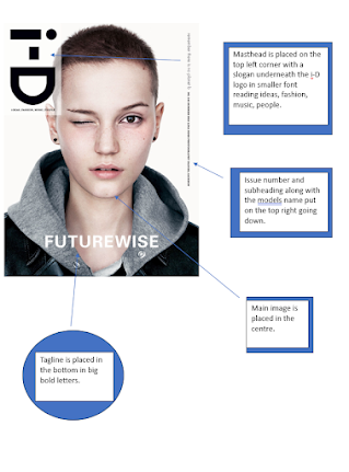
Terry Jones: A British graphic designer, art director and photographer who is best known for co-founding the street-style magazine I-D in 1980. He changed the fashion industry by creating the first emoticon which became known as I-D's signature logo. he was immensely popular before he created I-D as he worked for Vanity Fair in the early 70s and then was a creative director for British Vogue from 1972-77. until 1979 jones was a freelancer all around Europe as a consultant for the German edition of Vogue. he designed books and worked on advertising campaigns and is credited on several record covers.
I think that Terry Jones's work is good at visually showing someone's beauty and because of the great use of vibrant colours, his design is interesting and unique because it stands out for using shapes and colours to style the cover. the text and legibility are good as the text blends with the colours and is placed in either bold or small text in the middle side of different corners of the cover which gives more space for the main image.
Vince Frost:
He is the founder and CEO of his own company Frost Collective and is best known for being a graphic designer who works across advertising, design, digital, environments and fashion. he is passionately committed to designing a better world. after he became the youngest associate director he started his own studio Frost Design in 1994 now he works with his creative strategic team to help bring visionary ideas to life together with leading arts and cultural organisations.
His inspiration came from Neville Brody, Fabien Baron and Alexey Brodovitch as they were very focused on the magazine since there was a combination of typography, photography and design and he liked those three for different reasons.
The design and style of Vince Frost are very interesting as he makes letters and words big to have them stand out as main images of a cover or spread while having the text be put inside and having it blend well together since most of the time his designs involve the use of letters stretched or squashed making them more appealing to look at as they cover the whole page which allows the text to be placed within the giant letters or to the side of the page giving of a neat but radical design.
Opening scene Analysis Exposition: 16/11/23
Captain America The First Avenger (2011)
The film opens in a cold dark environment where there are a bunch of Arctic explorers discovering the frozen remains of a crashed plane stuck in the ice and as the scene continues we see two men propel down inside the cockpit of the plane the audience is enticed as we don't know why there is a plane frozen in the Arctic and we want to know how something like this happened. Then the scene ends with one man brushing the snow off some ice which reveals the iconic Captain America shield frozen in ice which gives off the sense that we will find out why the plane is in the Arctic as it has something to do with our protagonist as this exposition is intense but also confusing as the audience doesn't know what caused Captain America to be inside of a frozen plane but also concerned to see how the events of the rest of the movie play out to get to this scene. . the writer constructed the opening as a mystery since no one knows what happened and when it happened which is why one of the archaeologists says to his boss ''this one waited long enough'' implying that some time has passed since the plane crashed and was submerged in ice.
Spider-Man: Across the Spider-Verse (2023)
The film opens with the story of the first film being visually shown to us through the use of having the drumbeat constantly change the colour and scene whilst having it all come from the perspective of Gwen as the whole scene is filled with colour which visually shows the audience the life of someone like spider-man as she explains what miles has experienced as spider man on his own which shows how she isn't the only person who is spider man/women and with this the audience is shown what it's like to be Spiderman and as we see not everything in Spider-Man's life is perfect as we are shown some great losses and sacrifices come with the great power and triumphs that he has. The writers show the struggles of spider-man to allow the audience to relate to him on a personal level and since anyone can relate to any spider-man most of the exposition is delivered through conflict as Gwen is left stressed and aggravated by the end of the drum solo in which gives the audience a good example of how hard it is to live a double life.
Zombieland (2009)
The film opens with a monologue by Jesse Eisenberg's character Columbus over a shot of a small American flag on upside down car around a bunch of places on fire in which the guy holding the camera is chased by a zombie who quickly dies and the camera is then fixed on the zombies face. from this, the audience is given the exposition that the world is currently being destroyed and there is a zombie apocalypse. As the scene continues the exposition is given through intense action mixed with humour as we see three examples of dumb people during a zombie apocalypse whilst Jesse Eissenburg's character delivers specific survival rules to the audience that are essential to surviving against zombies even though his funny comments are placed over devastating gore and violence which is what the writer constructed the movie on as while there is a major world apocalypse going on funny stuff is still happening and people like Columbus just brushes off the bad stuff and uses common sense to explain to the audience in a funny way why these rules should be followed if you want to survive the zombie apocalypse.
Typography rules for magazines:
You need entry points to help readers to be engaged and start reading the content and have a gap between the heading and the body copy so there's no need for the indentation.
Measure line length to improve the readability of your text
You can be creative with the alignment of the text but make sure to align carefully and align left first. justification is also very commonly used. allow hyphenation to reduce unwanted gaps.
Break up blocks of text to make it easier to read.
Pair up fonts wisely as using two separate typefaces of fonts within the same block of text can be useful to separate the text and create a visual difference between them but whenever you do this make sure to keep the X-height the same.
Have hanging punctuation as when using hyphenation you should apply optical margin alignment or Roman hanging punctuation as it will keep the hyphens outside the edge of your text frame.
Make sure it's all caps as it's great for titles and headings but avoid using it on longer blocks of text because it makes reading uncomfortable and it also can feel like shouting. it is also easier to read when you have normal sentence cases because you can see exactly where the sentence starts and lowercase characters also give the ascending and descending stems which is a visual shortcut for faster reading.
Magazine Mind Maps:
These mind maps analyse magazine covers and a magazine spread for all of the conventions they have and what they mean when used in a magazine.
Area of investigation Mind Map:
This mind map is for my area of investigation and what I think would work best when covering the topic of the community as most of my photos will represent different parts of a community and the diversity. I chose community because there are different parts of a community and diverse communities that focus on certain things which I believe is good.
Planning For Magazine Cover Name Ideas:
Cooperation
together
Diversify
everyone and anyone
camaraderie society
Companion
With you
Here are some name ideas in different fonts and colours.
Here is the name of my magazine and I experimented by trying out different fonts and colours for each letter.
Magazine Sketch:
Here is a sketch of my idea for the magazine cover I have in mind.
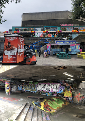
Trip photos: These are some pictures I took on our trip to the National Gallery, Covent Garden and Southbank that I shall use in my project that looks the most interesting and are going to be used as primary research for my area of investigation.
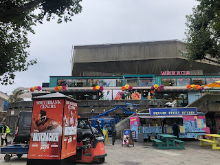
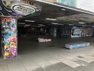
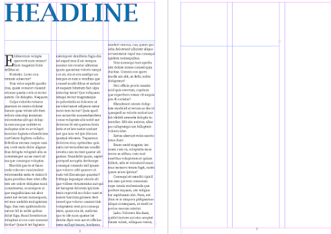
I've used paragraph styles and font styles to make this test version of a magazine
22/11/23 Magazine article:
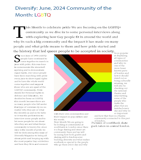
This is my finished magazine spread for my area of investigation. I chose to do community and my magazine focuses on every community with the idea that every month a new and different community is focused on in the magazine which is why the spread has an article on the LGBTQ community and another article focusing on what's coming next. I tried to have images and text organised neatly.
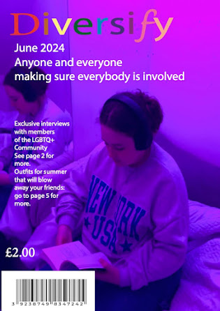
This is my magazine cover for my area of investigation.
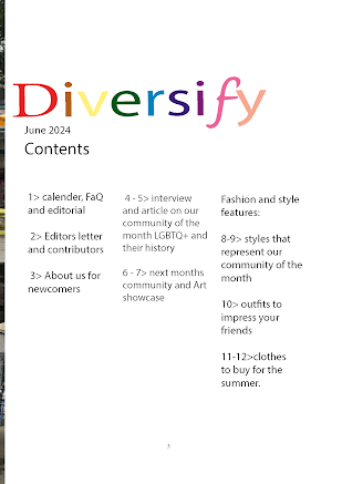
here is the content spread for my magazine.
Website Critique PowerPoint:
Presentation PowerPoint:
Opening scene Work: 23/11/23
Here are my influences and plans for my opening scene.
Script Writing: Ext. College - Day
Over video: 'Harlem Shuffle by Bob and Earl.
The camera fades in onto our protagonist walking on screen after passing through a turnstile. As he walks the camera follows him into -
Int. Lounge area - continuous
The protagonist continues strolling bouncing and jamming to the music he is listening to and as he walks the camera pans onto a bunch of friend groups all different and diverse emphasising the different communities.
He continues to walk through the lounge in beat with the music past more people in a group as he exits the building still vibing along.
Ext. main campus - continuous
He continues walking not caring about anyone or anything else in the world but his music as he glides past more people in groups. he does this because he believes that he doesn't belong in the overall community and prefers to be by himself with his thoughts.
It's clear that while his body language is positive his mental state is sad as he is alone and has no proper friends because he doesn't fit in.
As he walks towards the entrance of another building more people follow and pass by him as they all seem to be going to a class he then takes off his headphones and walks in with a more depressed tone of voice. which is where the scene ends.
Magazine Project:
Magazine Evaluation: 18/01/24:
For the magazine, I'm happy with how it came out and the pictures I used blended well with the fonts and text I'm glad I tried my best to make something nice to look at and something that could be a product and I think it turned out great. However, I will admit it isn't the best as the pictures of the spread came out separated along with some of the text having different fonts each time I would edit it. I also wish I could have added another page or something else that looked different to the final version to show a different variation or design for the magazine.
If I were to try and make a new magazine I would make sure that I would have enough space for text and pictures so that when I finalise my project the result doesn't look cluttered and cramped. I would have also used more pictures and made more pages to show off what a full magazine made by myself would actually look like showing off what I would use to fill all the cliches of magazine design from start to finish.
Here is a link to a small video recording I made that showcases the difference between sound quality
https://youtu.be/qgqvKcYoSS0
The way I created this was by fusing two different recordings of the same sound by fusing them together to test the difference between the sound quality from a boom mic and the sound quality of a camera. The way we recorded the video was by having both the camera sound and microphone audio be recorded at the same time. then we would edit each video and add both recordings of the same sound in Adobe Audition. we did this to test the difference between audio recordings from a microphone and a camera and since we fused the audio from the camera recording with the mic audio and put it over the same video.
Opening scene planning documents: 08/12/23
Rough Cut:
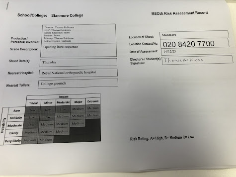
Risk Assessment:
Call Sheet:
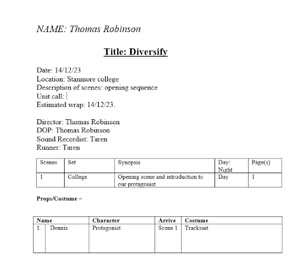
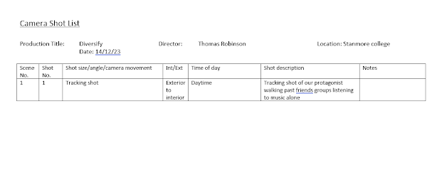
Soundscape Plan:
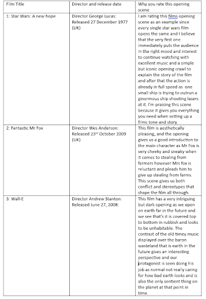
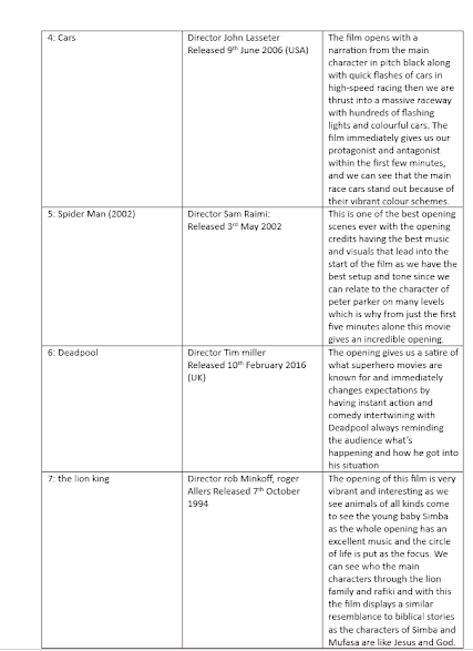
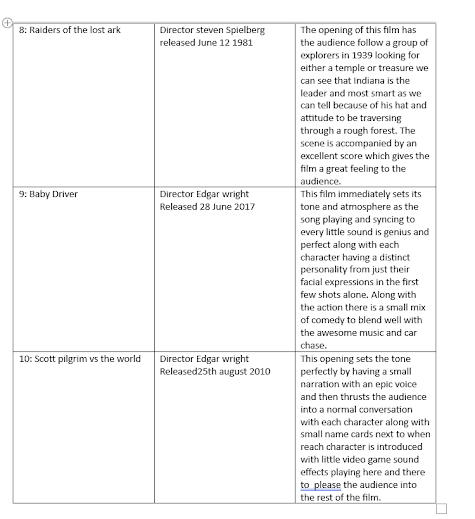
Best Opening Scenes: 12/01/24
Auteur Theory: 08/02/24 Auteur theory states that the director is more than just a conduit for the script and for the project. Every part of a movie is shaped by an auteur director as their fingerprints are visible in every aspect. most directors are not auteurs according to the theory anyway since there is a particular set of rules for defining a director as an auteur. the film's true artist is the Auteur and the visionary behind it but you can't have credit just by being the movie director.
The theory comes from France in the late 1940s, it was dubbed auteur theory by the American film critic Andrew Sarris and was an outgrowth of the cinematic theories of Andre Bazin and Alexandre Astruc.
There are three rules for Auteur Theory:
Basic Competency: a great Director has to be at least a good director as you can't have an auteur whose movies fail to clear some of the fundamental hurdles as the director's movies must be technically competent.
Signature Style: if a director isn't doing this he isn't an auteur. over a group of films, a director must exhibit certain recurrent characteristic styles which serve as his signature.
Interior Meaning: this is extrapolated from the tension between a director's personality and his material. It also means the director's innermost soul must come through in the movie.
Researching forms of auteur theory:
Wes Anderson is a great example of an Auteur director as many of his films follow a similar style and have a personal type of cinematography that is the same. he has a unique directorial style the reason being is because his style is instantly recognisable and iconic and he is considered a central figure in American eccentric cinema. his aesthetic style shows he follows the three rules of auteur theory as he has his signature style and competency since his films have always been successful and he expresses himself through the interior meaning of his films.
Auteur theory is mostly absent in the world of video game media but there are many examples of auteur theory where developers have taken credit and made their own aesthetic style whilst having a good reputation for good games with competency. for example, Hideo Kojima creator of Metal Gear is considered an auteur as he earned his right to have auteur-like control over the development of his games.
Auteur Theory references are applied occasionally to musicians, music producers and performers and since 1960 record producer Phil Spector has been considered the first auteur among producers of popular music. Spector created a new concept by taking control of everything choosing the artist's writing or picking the material and releasing the result on his own label.
Definitions of different sounds 19/02/24:
Diegetic and non-diegetic sound arent the same thing even if they are applied in movies and shows in similar ways.
Diegetic sound is the sound that comes from within the world of a film either on or off screen. its also known as 'actual sound' and it comes from the greek word diegesis which translates as 'to narrate'.
diegetic sound is used to help viewers get anidea of the story and understand whats happening on screen as it ranges from dialogue between characters to ambient sound in the background since diegetic sound reflects real life. it would be unnatural if there wanst any background noise in a film diegetic sound helps immerse the audeince into the world the characters inhabit. diegetic is only heard by the audience and the characters.
Non-diegetic sound is used for the audiences benefit as it the type of sound that is added in post production. its mostly used for tension or to add drama, increase the ambiance or to create an emotional reaction in the audience. most non-diegetic sound is music as a films score is added in after the film has been shot this is important as the score sets the tone for a film and drives the emotional impact of a scene. non-deigetic sound also comes in the form of narration and sound effects as they are also both added in post production and are also for the audeinces benefit.
Foley sounds are made in post production and our custom made and every sound was created for a specific moment in post production. foley sounds are the repordution of everyday sounds that are added to enhance audio quality. most foley sounds consist of running, walking or clothes rustling since these sounds arent captured when filming and have to be recorded afterward and added in later to create more natural ambient sound effects in a film.
contrapuntal sounds are when sounds are used in deliberate contrast to the action that is taking place on screen along with the tone and mood. contrapuntal sound is used to make scenes more realistic through the absence of non-diegetic music.
a soundtrack is a selection of recorded songs that accompany a film also know as an Orignal soundtrack (OST). the selection can include either pre existing songs or songs that were recorded specifically for the film. soundtracks help set the tone for certain scenes and can also add more interesting elements to a film since having a good soundtrack is key.
Soundscape Research:
The acoustic environment perceived by humans is what a soundscape is as its a work of art or performance that combines sounds in order to create a certain effect. Soundscapes are when music and sound are used to create the environment and atmosphere of the story being told. these vary from background sounds that depicts whats happening.
A soundscape includes three fundamental sound source types Antrhopophony or sounds associated with human activity, biophony or sounds produced by animals and gephony or sound generated by physical events such as waves, earthquakes and rain.
ADR - ADR or automated dialogue replacement is a process of re recording an actors dialogue in a quiet environment in post production. during a session of ADR the performer watches a looped scene of themselves in order to dub over new dialogue over the orignal production track. the actor must get near perfect lip sync since there isnt anything automated about this process.


.png)
.png)
.png)
.png)
.png)
.png)






No comments:
Post a Comment