Introduction to Research 11/09/23
Introduction
The aim of this session was to develop an understanding of research methods and their use in animation production and to develop my writing ability to a level where I can succinctly present research findings.
we learned about the terms primary and secondary research along with referencing and qualitative and quantitative information.
Research methods
Primary - information generated by yourself Interviews/discussions, focus groups, one-to-one surveys
Secondary - information generated by someone else, that you refer to websites, journals, or newspapers
Advantages and disadvantages of Primary and Secondary Research:
Primary research is up-to-date and can be obtained efficiently But the cost involved with the process increases as you obtain research.
Secondary Research saves time and is cheaper however lacks relevance and reliability of being valid for the question or objective and has limited control over the quality and accuracy.
Types of information
Quantitative - when info is gathered numerically, or measurable
Qualitative - information that is particular and goes into the details of a problem
We tested ourselves by picking out the types of information and research methods in a research text
Audience Theories - 18/09/23:
Hypodermic Syringe Theory - a message is given and the audience is inspired by it similar to a needle in the arm of the audience injecting them with ideas and values of the text and with this comes a direct flow of information from the institution to the passive audience. The broadcast of the War of the Worlds and the subsequent reaction of widespread panic fits into this theory.
Two-Step Flow Theory - Opinion leaders are targeted with messages from the media and then the general public follow their ideas and thoughts on the media product. this theory is used to identify those who encourage their followers and it suggests opinion leaders are intermediaries who interpret media messages before distributing them to their social peers and the audience is viewed as active and influenced by opinion leaders rather than directly from media content. Billionaires like Jeff Bezos and Elon Musk both share vital opinions and ideas that inspire and influence audiences as they are well-known people who share similar opinions on a certain media message.
Uses and Gratifications Theory - this explains that everyone has a different use for media as we expect to get some sort of gratification from it and it suggests that the individual audience member has the choice and power to select specific media texts to best suit their needs. Instead of being injected with a specific message in the hypodermic syringe theory, the audience can choose the best-fit media text for them. This theory focuses on four things Personal identity, Information, diversion, and social interaction. Shows like Luther satisfy the need of those who prefer crime drama or mystery shows whereas Marvel films are a good form of immersion/diversion which also encourages social interaction as people will want to talk about their favorite characters and moments from a certain show or film.
Cultivation Theory - this explains how constant exposure to themes in mass media causes the audience to overestimate the probabilities and potency of those themes in the psycho-social worlds of the self and significant others. the more television is watched by people the more likely they hold a view of reality closer to the depiction on television. for example, people who watch crime dramas may believe that the world is more dangerous than it actually looks even though they know the shows are fictional.
Digital Image Types:
JPeg:
Jpegs are files that support images and have a continuous tone which means that all shads and colours are portrayed within the image. Jpegs are lossy or lossless and are generally compressed with lossy comparison using compression the creator can decide how much loss to introduce and they are not good for sharp edges.

PNG:
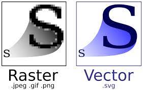
PNG or Portable Network Graphic is a raster graphics file format that supports more pixels which improves the resolution and the graphics of the image.
Transparency refers to the background having nothing to do with the background pixels allowing what's behind it to show.

Resolution:
sometimes referred to as DPI (dots per inch) but is normally measured in Pixels per inch.
web images are low resolution and typically 72 PPI and are not to be enlarged.
Examples of the different types of Resolution:
GIF:
Graphics Interchange Formats better known as GIFS support static and animated images.
Example of a GIF:

SVG:
Scalar Vector Graphics or SVG Define 2D Graphics and have support for interactivity and animation. SVGs don't rely on unique pixels to make up the images instead use vector data.
My Ideas for an Event:
Event Poster Project: My project consists of a stargazing event that is available and accessible to everyone.
I came up with this idea by thinking of what type of events would be most appealing to all ages and stargazing is a good example.
I took pictures of trees at night as a reference to help shape my poster and then used Photoshop to edit out the sky and added in a more vibrant starlit sky to make it more extravagant.
Here is what the finished project looks like.
Here is a sketch of my project to show an example of what it may look like.
here is my planning document which kept track of what I did to my project up until the deadline.
This is the final part of this project with my mock-up of a social media header for my event the first one is graphic and the second is photographic they weren't made on a template as I found it easy to add text boxes on a white backdrop and add in all the images i needed for my project.
Event survey:
Here is what my poster will look like as an advert on a bus stop I pasted the image of my poster onto the image of the bus stop skewered it down and moved it into the right position.
Peer feedback:
when I presented my ideas for an event the feedback I received was neutral and positive with some people pointing out that the text was too small and that there was a need for improvement in my overall design and slogan I even got a better idea for a slogan from someone who sent feedback on my presentation which helped me improve on my original project.
overall I adapted this feedback to my project by making the text bigger and I added a more interesting design to my next poster.
Evaluation:
My aim was to create an event that would be interesting to everyone and be able to appeal to any age group. the inspiration came from the idea of a social gathering of people looking at the stars at night as stargazing brings together the community in most places and is very popular with non-astrologists.
I created my posters using Photoshop and Illustrator and by implementing my own pictures that I took and blending them with different backgrounds. I used Photoshop to make a graphic poster and Illustrator to create my photographic one and then I created two different social media headers which would give an idea of what my event would look like if it was actually being promoted on social media.
My research came from both a survey and facts I could find on stargazing as apparently, stargazing has become quite popular in recent years making my event very convenient. those who filled out my survey were impressed by the idea of my event however it lacked a decent design and the opinion was mixed on whether they would be enticed to go to an event on stargazing but did like the posters.
there weren't any problems with my work or any hindrances I dealt with when I needed to.
I think that what went well with my product was taking pictures and then adapting them into Photoshop and Illustrator as the process was simple and I'm happy with how they turned out as the posters communicate what I thought would be good advertising for an event. however, what didn't go well was the social media header as I believe they could be improved while they were done to the best of my abilities I think I could've made a smoother layout for the headers even if what I've done is satisfactory along with making sure my presentation has enough information to give out the general idea of what my event is about.
If I were to repeat this project again I would maybe try and add more detail to my graphic poster along with making sure that in each poster the font is big enough and vibrant enough to stand out. I also think I should make sure I differentiate both photographic and graphic posters by making sure that I don't use my own pictures for the graphic poster like I did at first before making one.
Formal Elements of Photography: Shape - a shape or outline is one of the strongest ways of singling out an object or person and is utilized to create balance and symmetry or to lead the viewer's eyes toward the main subject.
Texture - concerned with surface. the visual appearance of photographs suggests how they would feel to your touch.
Pattern - appealing to the human eye and either being repetitive and formal or irregular and off-beat. you can create a point of interest by finding and exploiting visual patterns in a scene.
Line - used to create more complex shapes or to lead the eye from one area in the composition to another.
Form - is connected to the volume and solidity of an object.
Color and Tone Values - color and tone both contribute greatly to emphasis and mood.
Lighting and Photography - 21/09/23 Key light - does most of the work for continuous lighting up your subject's face any other lights used will compliment the work done by the key light.
fill light - used in conjunction with the key light and brightens the shadows cast on a subject by the key light.
Hair light -this light has different names depending on if your subject is human or an object but provides the same purpose as the light is only meant to fall upon a small part of the subject. Background light - helps to eliminate shadows cast on your backdrop by your subject
Camera Mounted Flash - flash can be bounced off the ceiling to diffuse the light before it hits your subject.
Split light - this light covers 90 degrees to your subject's face with one side lit up and the other in the dark.
Rembrandt lighting - one side of the face will still be in shadow but one triangle of light should fall on the cheek this light source will slightly be the head height of a subject.
Loop lighting - when the light is placed slightly higher than eye level it gives a contouring look to your subject's face. this type of light is very flattering on people.
Butterfly lighting - this light casts a butterfly shadow directly beneath the subject's nose and when the light is placed high enough using lighting stands you may get shadows cast off the cheeks of subjects with prominent cheekbones.
broad/short lighting - when your subject's face is turned slightly in one direction your light is broad if it casts the side of the face closest to the camera in light.
Composition in photography: - 21/09/23 1- Rule of thirds - this keeps the subject from being in the center of the photograph and keeps the most important part of the image at the intersection of the lines.
2- leading lines - lines are used to lead the viewer's eye to the subject of the photograph.
3 - patterning/symmetry - finding similar-looking objects to create an interesting photograph
4- framing - using something in the photograph to enclose the subject
5- Depth of field - Giving a photograph a sense of depth by focusing in on a subject making the background become more blurry
6- viewpoint - when you take a photograph you can dramatically change the resulting image.
7- bird's eye view - when the camera is facing/looking down at an object or person from a high distance like a bird in the sky.
8- Worm's eye view - when the camera is looking/facing upwards at an object or person from the ground like a worm.
Here are some of the photos we took in the studio demonstrating the effect of different lighting techniques used in photography such as key light fill light and backlight.
Photographer Research - 25/09/23
Robert Frank: He began studying photography in 1941 in Zurich Geneva and Basel studios. He traveled to America later on which was where Alexey Brodovitch hired him to compose fashion photos at Harpers Bazaar. He put loads of time and effort into producing films such as ''Pull My Daisy'' and ''Cocksucker Blues'' and he continued to produce still photography in addition to films up until his death in 2019.
This example of his work shows a black and white photo depicts people riding in a tram carriage and in each window, there is a different person of age race, and gender showing diversity.
I think this photo has good symmetry with the overlapping pattern along with its simplicity which gives it quality along with having more than one main subject.
Steve McCurry: - A freelancer photographer who is most famous for vividly using color in his photographs as he believes ''the world is in color so its logical to shoot it in color''. his career has seen him tackle conflicts, and vanishing traditional cultures from contemporary society.
An example of his work comes from the photograph Afghan Girl which documents the impact of war and how it creates conflict for humans and the environment.
This picture only focuses on one thing however I believe it conveys so much with the expression on the girl's face telling so much about how people live in places like Afghanistan and how conflict is always making anyone's lives more difficult and stressful which is why this picture is important at conveying a message rather than being appealing to the eye.
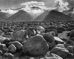
this example of his photography work shows that he was into using black and white but also used different angles and points of view to give off a nice look and feel to the picture as a whole giving this one a landscape-style shot.
I like how this shot spans across a long field of view by showing off mountains in the distance and having a nice symmetry pattern with the rocks along with having a circular smooth shape in the whole image.
Mise-En-Scene: 25/09/23 Mise-en-scene refers to what is put into a scene or having visual information in front of the camera as it communicates essential info to the audience with five main elements. The elements are: 1- settings and props - locations or settings play an important role in film-making as they can manipulate an audience by building certain expectations and then taking a different turn. 2- costume, hair, and make-up - these are used as instant indicators to the audience of a character's personality status and job as certain costumes can signify certain individuals such as a protagonist or antagonist. 3- Facial Expressions and Body Language - body language indicates how a character feels towards another or can reflect the state of a relationship between two characters while facial expressions provide indications of how someone is feeling.4- Lighting and color - color carries connotations that add meaning to a scene by giving it a particular look and feel whereas lighting highlights important characters or objects or makes characters look mysterious by shading sections of the face and body within a frame. lighting comes in many types three points, high key, low key, fill, and backlight. 5- Positioning of characters/objects within the frame - placing characters in certain parts of the frame links back to lighting and color in which a mysterious or villainous character may be placed off to the side of a frame where there is less light rather than being in the light where the hero or any other characters are placed to resemble them being protagonists.
Styles of Type: 25/09/23
Serif - a stroke or small line regularly attached to the end of a larger stroke in a letter or symbol.
Slab Serif - where the font is squared off giving the font a blocky appearance rather than the refined look.
script - a genre classification for typefaces
Sans Serif - represents something clean minimal friendly and modern.
 Legibility and color systems - 27/09/23
 - Legibility - the fact of being easy to read or which something is easy to read is greatly affected by the perceived contrast of text and background. Legibility problems are solved when you get adequate luminance contrast it can also refer to behavior or architecture for example the perspective of communication research is described as a measure of the permeability of a communication channel.
Color Systems - a set of colors that represent a specific visual spectrum. colors are then mixed together to create a limited usable range which that range is called a color system Examples include RGB, and CMYK the visual response that corresponds to luminance contrast is the brightness difference between symbols and backgrounds.
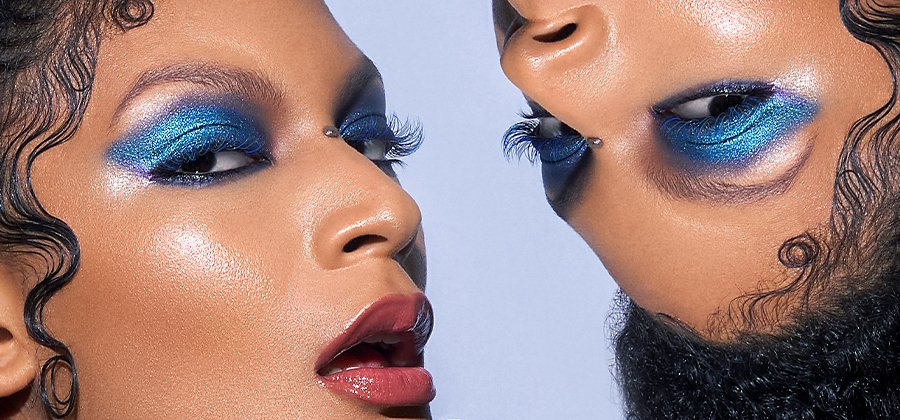
Fashion Photography: 02/10/23 Fashion photography portrays clothing and fashion items which sometimes includes couture garments as fashion photographers are responsible for how clothing is presented in advertising and many other genres of photography fall under the umbrella of fashion photography which are editorial, Advertising, and Beauty.
Editorial: images that appear alongside text in print or online publications,. editorial photos are as they help tell a story or support the narrative in the text with a focus on creating specific moods or tones for the piece as this type of photography is one of the most popular niches in the industry.
Advertising: this involves taking pictures of products or services as these types of photographs are used in print such as newspapers and magazine ads or could be featured online, on a billboard, and in TV advertisements.
Beauty: this genre of photography involves shooting close-up images of subjects highlighting attractive features for editorial, commercial, or personal purposes.
Hard and Soft lighting: Hard Light is harsh which creates strong shadows is more focused and has more contrast and is usually brighter than soft light whereas soft light is more diffused and creates shorter shadows and is usually more even and tends to wrap around objects projecting diffused shadows with soft edges.
How to set up a studio for fashion Photography:
1- lots of fashion shoots are done in a studio however you could use the light around you to highlight specific areas or objects that you are advertising such as using lamps or torches.
2- color is also considered as having bold colors that are popular in fashion and advertising photography can control the viewer's eyes by drawing attention to specific areas of the photograph through the use of color.
3- Location is vital as you need to decide where your photograph will be and whether or not you should contrast the garments with the location some photographers will shoot a model in a glamorous ball gown underneath a motorway bridge as it is something beautiful and expensive in a gritty dark area which is why lots of photographers move outside into the world where people are wearing what they sell.
4- narrative allows adverts that are too short to tell a story as shots can be made to look like they are part of a story with a fairytale-like quality.
5- poses allow models to best show the garment or accessory in one photo which is why they hold very awkward and extravagant poses as capturing models suspended in the air is a common pose to show the fabric's qualities.
How Fashion Photography has changed over the years 1950s to the Present day: ever since the shift from film in the late 20th century innovators have taken advantage of digital photography possibilities as photography offers editing and sharing on larger scales and faster timelines than ever before. photography has changed so much over the years due to the number of techniques and perspectives coming from different photographers in different decades along with technology people are evolving and finding new and inventive ways to take photos for fashion.
1960's


